Where is Blockchain — W6
Designers | Alex Newson • David Han • Sue Heeyeon An • Tatiana Bohsali
External Partner | This Ain’t Rock’n’ Roll
Brief | Design a way to materialise blockchain
Make it Apparent
As the interactions were absorbed inside the application, only through simply touching and navigating through the screen, the blockchain technology remained obscured. In order to make it apparent, we thought stripping away high technologies from our current design will build more visible engagements - intangibles to tangible properties (fig 2).
Fig 1. Breakdown of Blockchain in layers. Image by David.
Fig 2. Stripping Away Technologies. Image by Alex.
Fig 3. Brainstorming Materialisation. Image by Alex and Sue.
After brainstorming, the main iteration of the store was materialising the transaction recording system into physical properties, using a roll of paper where people can write down their transactions (fig 3). This idea was to demonstrate the transparency of the transaction histories and itself becoming a chain. I thought we still haven’t made it completely look like blockchain but maybe it was something we can further develop on. Yet, personally I questioned how it serves the very purpose of immutability once it’s brought into tangible territory. Also I wondered if this is adding another layer of complexity for people. Moreover, we transformed the verification process into two code verification from ‘Word of Mouth’ and locker passcode. Tatiana’s idea of ‘Word of Mouth’ was a way to distribute the code from person to person.
“The most powerful marketing is personal recommendation.”
I was very intrigued by the idea of bringing people together in order to access the shop itself and building trust between people which becomes a Peer to Peer (P2P) Validation Mechanism - Proof of Friendship. However, this made me question if the shop that owns itself becomes ‘re-centralised’ by the patient 0, few number of people from a selected proposal having the authority over the store. Maybe the next question we need to consider would be how we can distribute the code to decentralise the store again.
Development
Whilst our idea was to invite people to design the second version of the shop after experiencing the first, David pointed out that the first shop being created and the context set by us as designers are not considering the people and it's more of our assertion. I completely agreed with his point, following on Clive’s point from This Ain’t Rock’n’Roll, the store can also be as a method of gathering the needs in the first place. However, we were missing out the very central context, people of Brixton. So we made a tweak of the store being dependent on people. Providing the main framework including the key DAO rules of the shop then allowing people of Brixton to adopt the proposed theme into it. To do this, Alex and David ran a workshop to gather proposals and Tatiana and I worked on branding and the design of the store.
From the workshop, the concept for the ‘store’ became exchanging snacks with students when the canteen and cafe closes and also introduce a diverse range of snacks from different cultures - Sweet for Sweets. The context created from Tiana and Slyvester’s proposal was then adopted into the Brixspot framework we designed previously.
Fig 4. Proposal Workshop. Image(s) by David.
As we weren’t able to run the workshop with people in Brixton, we reframed it in LCC.
Fig 5. Brixspot and Store Design. Image(s) by Sue and Tatiana
Tatiana and I took Memphis Design as an inspiration to design the logo of ‘Brixspot’ - refusing the norm and applying uniqueness.
Main element of the store design is to have full transparency of the items and also to illustrate how the stores can be in different forms depending on peoples’ proposals.
Fig 6. Mid Fidelity Prototype Sketch. Image by Sue
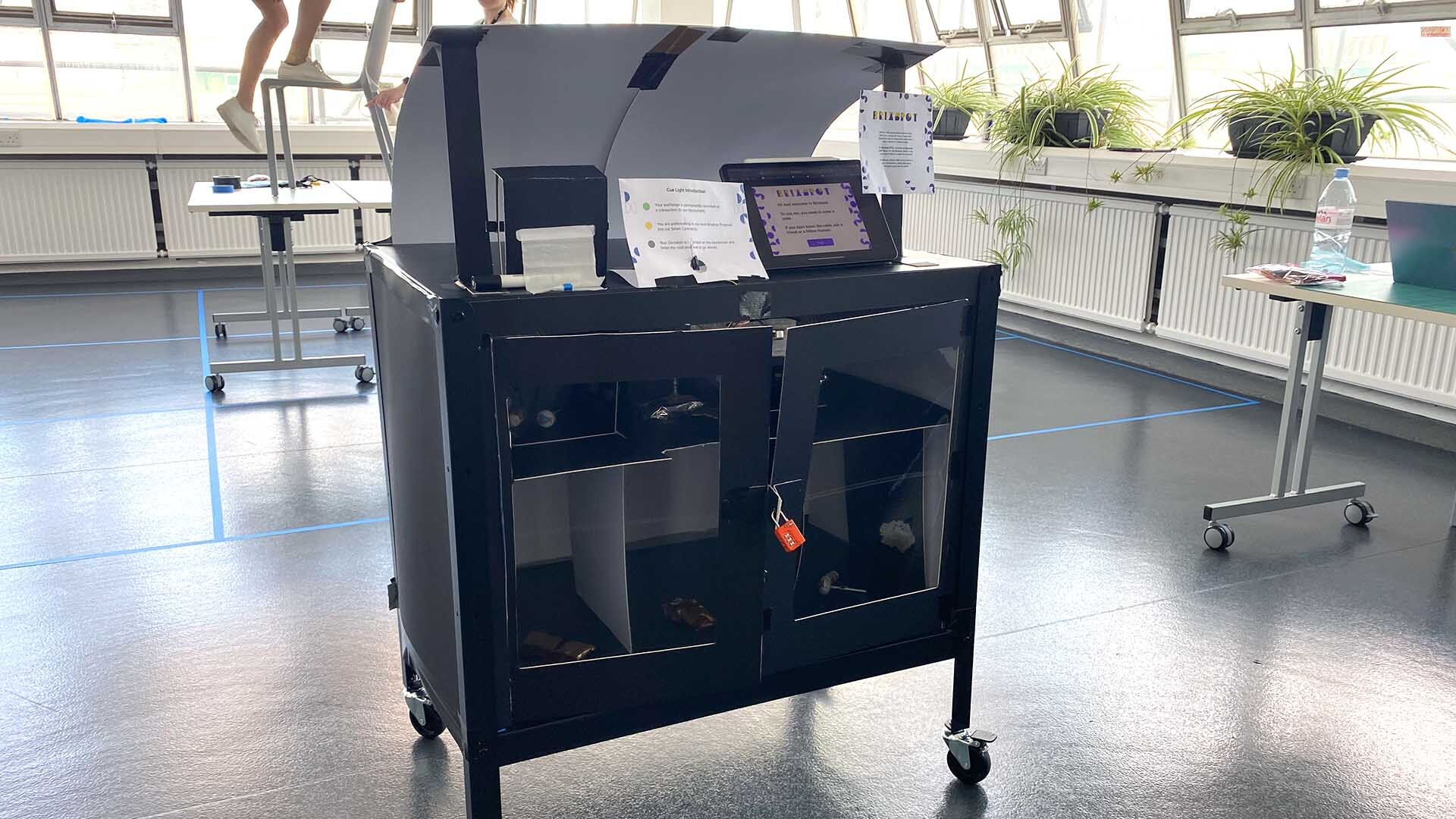
As we couldn’t find appropriate material within the time we have, we decided to use Tatiana’s shelving unit and reform it.
Of course, the size was not perfectly suitable as the height was low - needed to bend down to access the locker but it served the purpose.
Prototyping
Fig 7. Building Mid Fidelity Prototype. Image(s) by David
Mid Fidelity Prototype
Fig 8. Mid Fidelity Prototype. Image by Sue.
Fig 9. Testing the Prototype. Image(s) by Sue and David.
Vid 1. Digital Prototype. Made by Group. Edited by Sue.
Fig 10. Description and Instruction. Image(s) by Tatiana and David.
Reflections
For Speed Dating we have planned to test the experience of the shop to peers. During the session, most of them pointed out the guidance of the interactions weren’t clear enough which made them confused a lot. How do we make the interaction more understandable? Most importantly, how do people know that this store owns itself? One week left and still a lot to figure out! Chop chop!
Fig 11. Brixspot. Image by Max.


